Timeline Area in PVRTune
Content
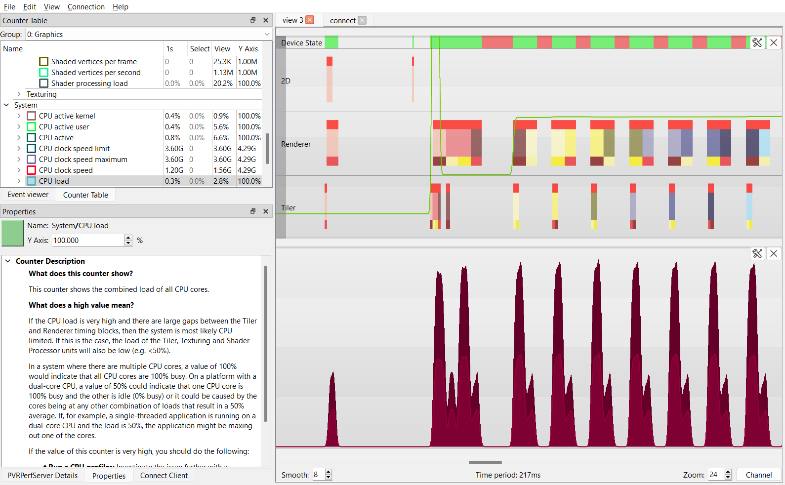
The Timeline area visualises captured data. The image below shows an example of static data displayed after a saved .PVRTune file is opened, using the default graph view. Time increases from left to right so a graph can give a clear picture of what the application was doing over the course of the recording period. In this example the information is split into three distinct graphs, which capture render timing data and counter data.

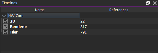
Each graph is divided into several timelines which can be toggled using the Timelines docking window as seen below. The shown available timelines display timing data emitted by GPU hardware blocks, such as the 3D renderer and the tile accelerator.

Device State
At-a-glance indication of the device state; when enabled, a small additional timeline per GPU shows green for active, red for blocked, nothing for idle.
Timing Blocks
This timing data within each timeline is split into different coloured blocks. Timing blocks give a visual representation of how busy the hardware, driver and firmware are at any given moment during the profiling session. They depict events that have a defined beginning and end. The width of the block corresponds to the duration of the task.
Hovering over the timing blocks will display some additional information about the event such as PID, frame, or task.
Selecting these blocks will display the full event information in the Properties window. This will also keep that activity permanently selected until another timing block, counter, or empty space in the graph is selected.
An explanation of how to read and interpret these timing blocks will be given in the Understanding Timing Data section.
Counter Data
Counter data is also displayed in the Timeline area, in the form of line graphs which represent how the value of a counter has changed over the recording period. The appearance of each counter and whether they are displayed can be customised using the Properties and Counter Table windows respectively.
Note
If the analysis were based on real-time profiling, which is dynamic in nature, the displayed timing data would appear to be continuously changing with time.
Interaction
A number of actions can be performed when interacting with the Graph view.
Zoom
Zooming in and out of a graph is a useful feature for being able to visualise details of the captured data, as well as having a more general perspective of the data trends overall. One method of zooming in and out is to use the scroll button of a mouse in the Graph view. Alternatively, a zoom value can be specified in the Zoom field. The lower the zoom value, the bigger the magnification and vice-versa; the units are microseconds per pixel.
Note
By default, scrolling up zooms out (decreases the size of the graph) whereas scrolling down does the opposite. The mouse wheel action can be inverted in the Preferences window.
Smooth-out Counters
Counters displayed in the timeline can be noisy. They may be smoothed out by specifying a value in the Smooth field. The maximum value is 80 and typical values would be somewhat less than 10. Increasing the value will smooth out the counter so the counter plots become easier to interpret.
Note
Holding the Alt key and rolling the mouse wheel varies this value.
View Captured Data over the Entire Time Period
To adjust the Graph view so the captured data is displayed for the entire time period, perform the following:
Right-click a graph in the Timeline area. This will open an action menu.
From the menu, select View Selection/All.
Note
The value of the total visible time period is specified at the bottom of the Graph view.
View the Start of the Captured Data
To adjust the graph view so the start of the captured data is shown, perform the following:
Right-click a graph in the Timeline area. This will open an action menu.
From the menu, select View Earliest.
View the End of the Captured Data
To adjust the graph view so the end of the captured data is shown, perform the following:
Right-click a graph in the Timeline area. This will open an action menu.
From the menu, select View Latest.
Select a Time Range
A specific region can be selected on a graph. The selection of a time range is relevant when viewing averaged values over the range.
This can be achieved by holding the Ctrl key whilst left-clicking and dragging on a graph. Hold Ctrl and click on a timing block to select the time range of the block. Additionally, hold Shift to extend the current selection. To deselect, hold Ctrl and left-click in a blank area of the graph.
Change the Graph View Layout
The layout of the Graph view can be changed to a single or split view layout. This is carried out by using the Single Window Layout and Split Window Layout options from the View menu.
Change the Graph Rendering Options
During an analysis task, certain types of data can be shown or hidden on-demand in the Graph view. To change the data render options, perform the following:
Right-click a graph in the Timeline area. This will open an action menu.
From the menu, select or remove the options:
Render 25%
50%
75% Quarters
Render Timing Data
Render Marks
Render Ruler
Restore the Default Graph View
After changes to the Graph view have been made, it is possible to revert to default settings. To do this, perform the following:
Right-click a graph in the Timeline area. This will open an action menu.
Select Restore Default View.
Close a Graph in Multi-Graph View
In a multi-graph view, it is possible to close one of the graphs by selecting its corresponding button to close it.
To display the graph again:
Restore the graph view to default;
Choose View → Insert New Graph Pane, or drag and drop from the Counter Table onto the area between, above, or below a graph name.
Add and Remove Tabs
Tabs displaying graphs can be added and removed on demand. This procedure is highlighted in the File Menu section.
Save a Graph as an Image
PVRTune GUI comes with different options to allow graphs to be saved as images. These are different modes available for saving a graph. To save a graph as an image, perform the following:
Right-click a graph in the Timeline area. This will open an action menu.
From the menu, select the required save setting:
Save Image with HUD: saves the context data when the mouse is hovering over a graph.
Save Image: saves the image in the same location as the binary.
Save Image To…: saves image to a user-defined location.
Pause the View during Connected Analysis
During real-time profiling, the Graph view continuously changes with time as the collected data is dynamic. To pause the view at a given time, perform the following steps:
Right-click a graph in the Timeline area. This will open an action menu.
Select Pause View. Alternatively, click and drag on the graph view to scroll. This automatically pauses the view.
Add and Remove Counters to Graph
Counters can be added on demand to the timeline by selecting them from the Counter Table window and dragging them to the graph. This is covered in more detail in Adding a Counter to the Graph View.
Note
Some counters, when added to a Graph view, may not be immediately visible due to very low or very high Y-axis values. This can be overcome by adjusting the Y-axis scaling of the counter. See Counter Properties for more information.
View Events
Several events (known as marks) are displayed in the timeline in addition to all the other information. These marks are signified by bars running from the top of the graph to the bottom. A full list of the supported events can be found in Events.

