Setting Up a Simple UIRenderer Layout#
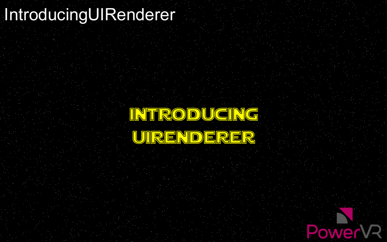
A simple example is the best way to better understand UIRenderer layouts. This example will print a scrolling marquee, Star Wars-intro like, with some icons at the corners of the marquee, scrolling text, and some text in the corners of the screen. This starts from being a single point in the centre of the screen and blows up to take up the entire screen.
The steps are as follows:
Create text for the lines marquee, image for the icons, and put those in a
MatrixGroup.Put this
MatrixGroupin aPixelGroup.Set the anchor of the marquee texts to Centre, and calculate the fixed
PixelOffsetof each text based on line spacing. On each frame add a number to each text’sPixelOffset.``yto scroll them.Anchor the
TopLeftof the top left symbol to theTopLeftof the matrix group. Anchor theBottomRightof the bottom right symbol to theBottomRightof theMatrixGroup, and so on.Calculate a suitable transformation with a projection to nicely display the marquee relative to its containing group. The marquee and symbols will move as one item here.
Anchor the corner text with the same logic, potentially offsetting it so it does not touch the borders.
Finally, centre the
PixelGroup, and set its scale to a very small number. As it increases frame by frame, the group takes up the whole screen when it reaches the value of one.
To see this in action, take a look at the PowerVR SDK demo, IntroducingUIRenderer.


